Psst… I'm open for work : )

©2026 Cecilia Garcia

OVERVIEW
Crocs is a globally recognized footwear brand known for its bold and playful identity.
PROBLEM
Crocs’ current website:
feels generic and template-based, lacking the brand’s personality
struggles with poor responsiveness on smaller screens
doesn’t reflect the brand’s message of individuality
SOLUTION
Proposed design introduces:
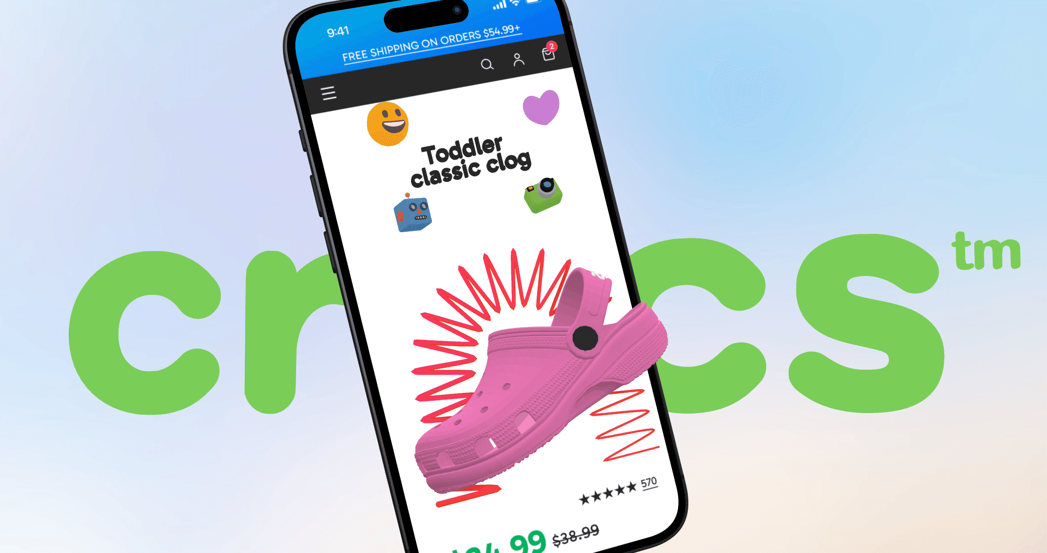
a visual design system aligned with Crocs’ playful identity
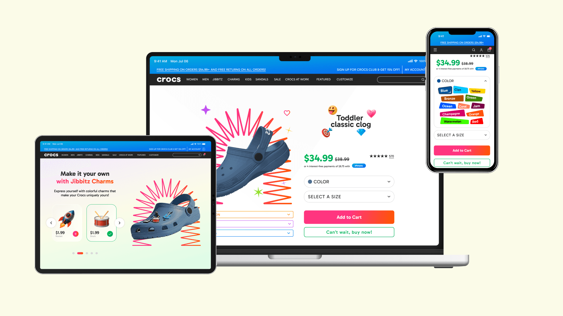
a layout that works smoothly across all screens sizes
customization features as an expression of “Come As You Are”
MY ROLE
UI Design,
Art direction
TEAM
Ceci Garcia
TOOLS
Figma, After Effects, Spline
DURATION
3 months
01/CASESTUDY
02/RESPONSIVE DESIGN
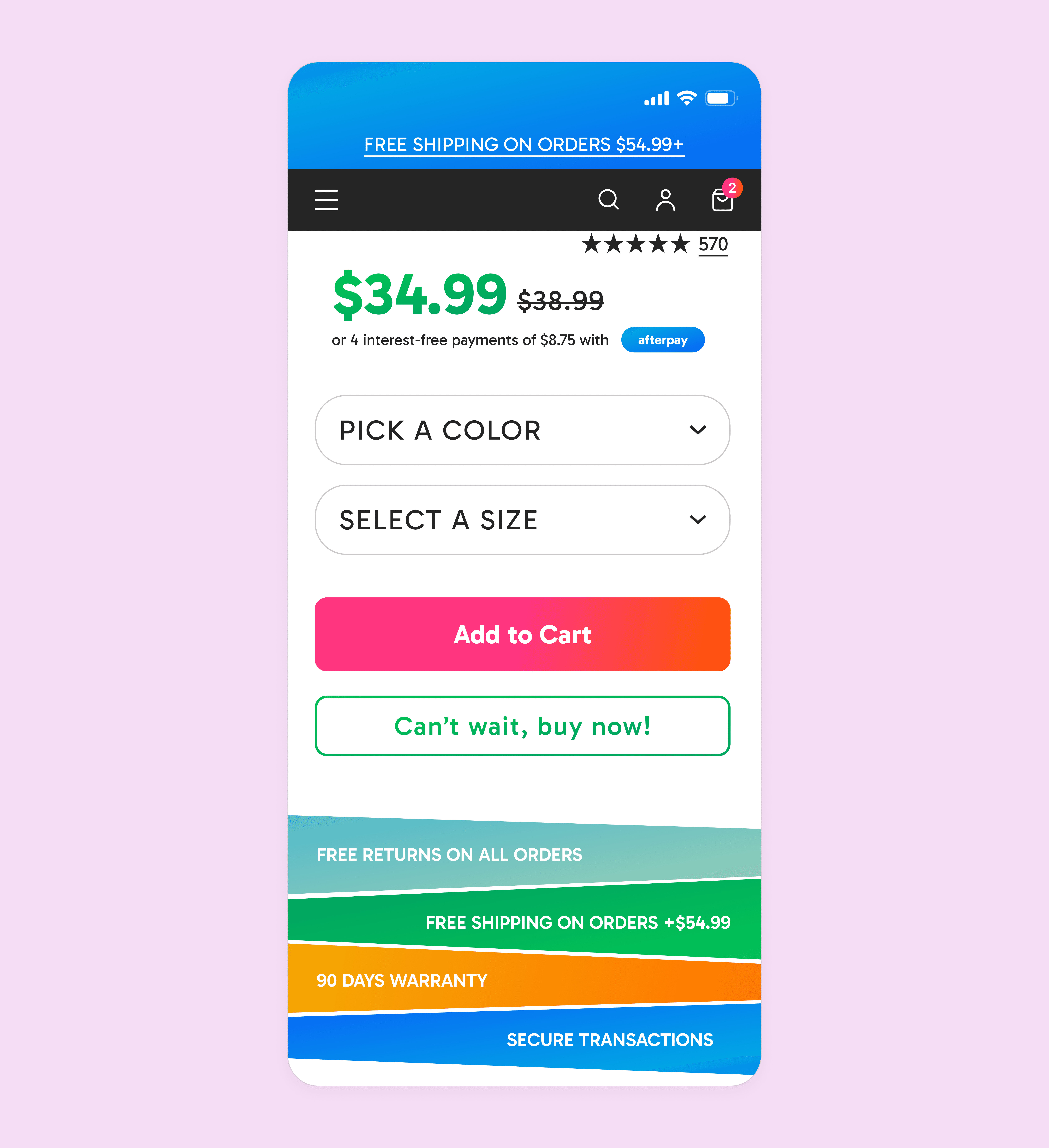
With most shopping happening online, the website is now the main way customers experience Crocs. The redesign makes the digital journey as engaging as shopping in-store, with responsive layouts and playful interactions across all devices.
-> If the website is the store, it has to feel just as fun as walking into one.


03/DESIGN SYSTEM


