Psst… I'm open for work : )

©2026 Cecilia Garcia


OVERVIEW
Anahí is a custom typeface inspired by the history of indigenous Argentina.
PROBLEM
The challenge of visual translation:
capturing the duality of Anahí’s human form and her transformation into the ceibo tree
translating a narrative of resistance and organic growth into a structured, functional typographic system
SOLUTION
A narrative-driven display font:
mimics the curves of the ceibo flower to symbolize rebirth and endurance
immortalizes the legend of the Guaraní woman who resisted colonization through bold, resilient strokes
MY ROLE
Designer
TEAM
Cecilia Garcia
TOOLS
Figma, Illustrator, After Effects, Google AI Studio, Flora AI
DURATION
4 months


01/CASE STUDY
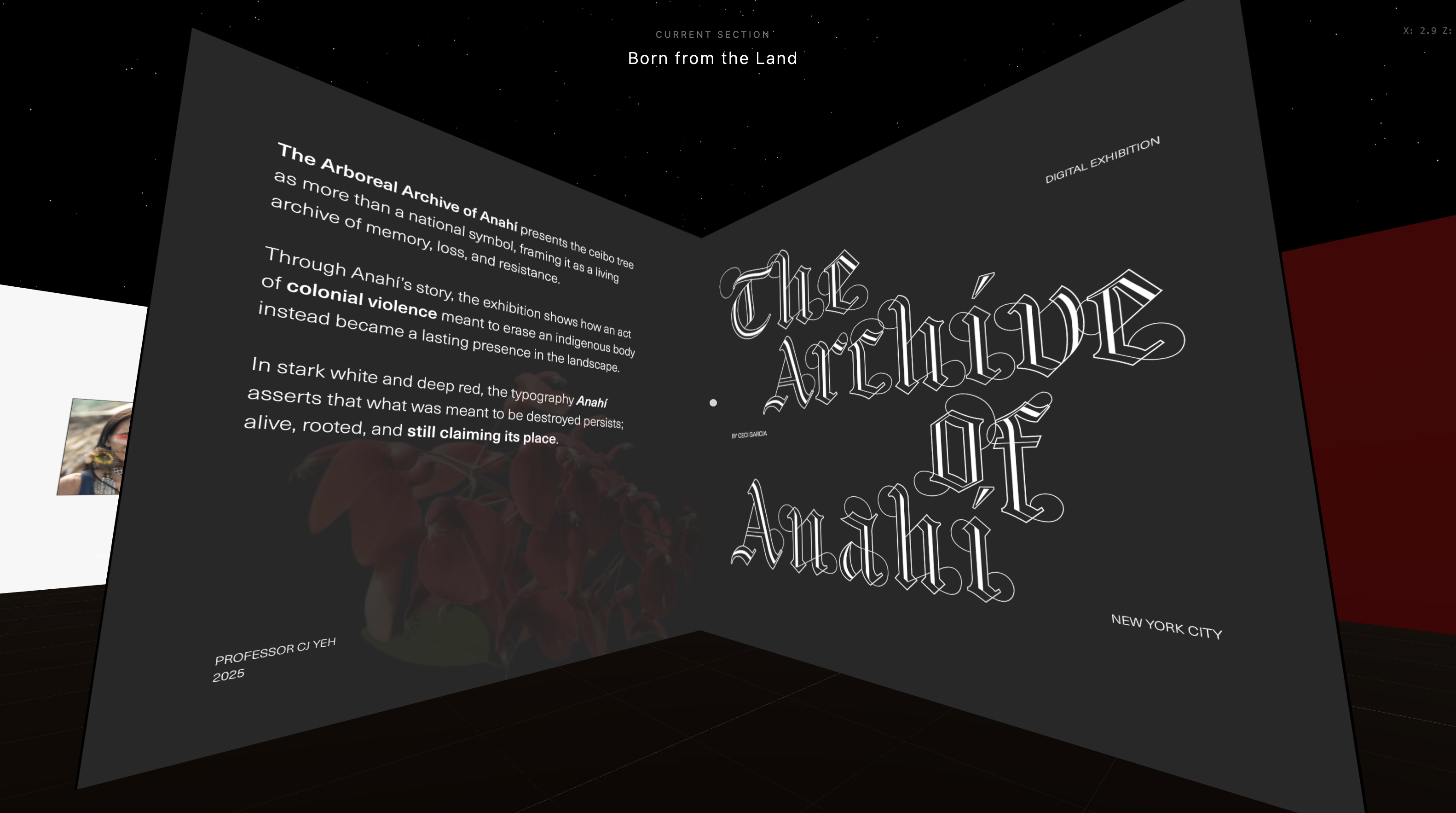
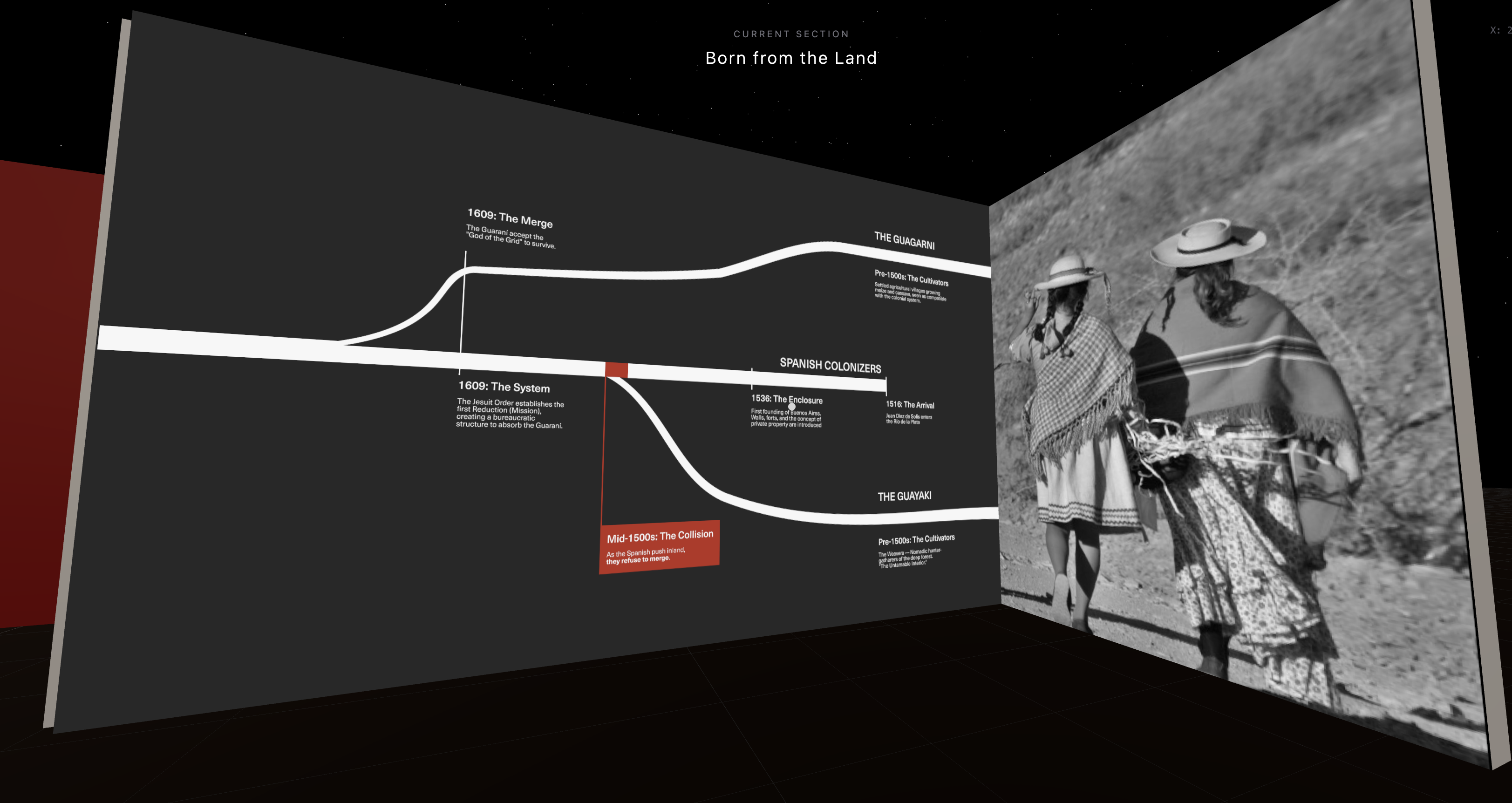
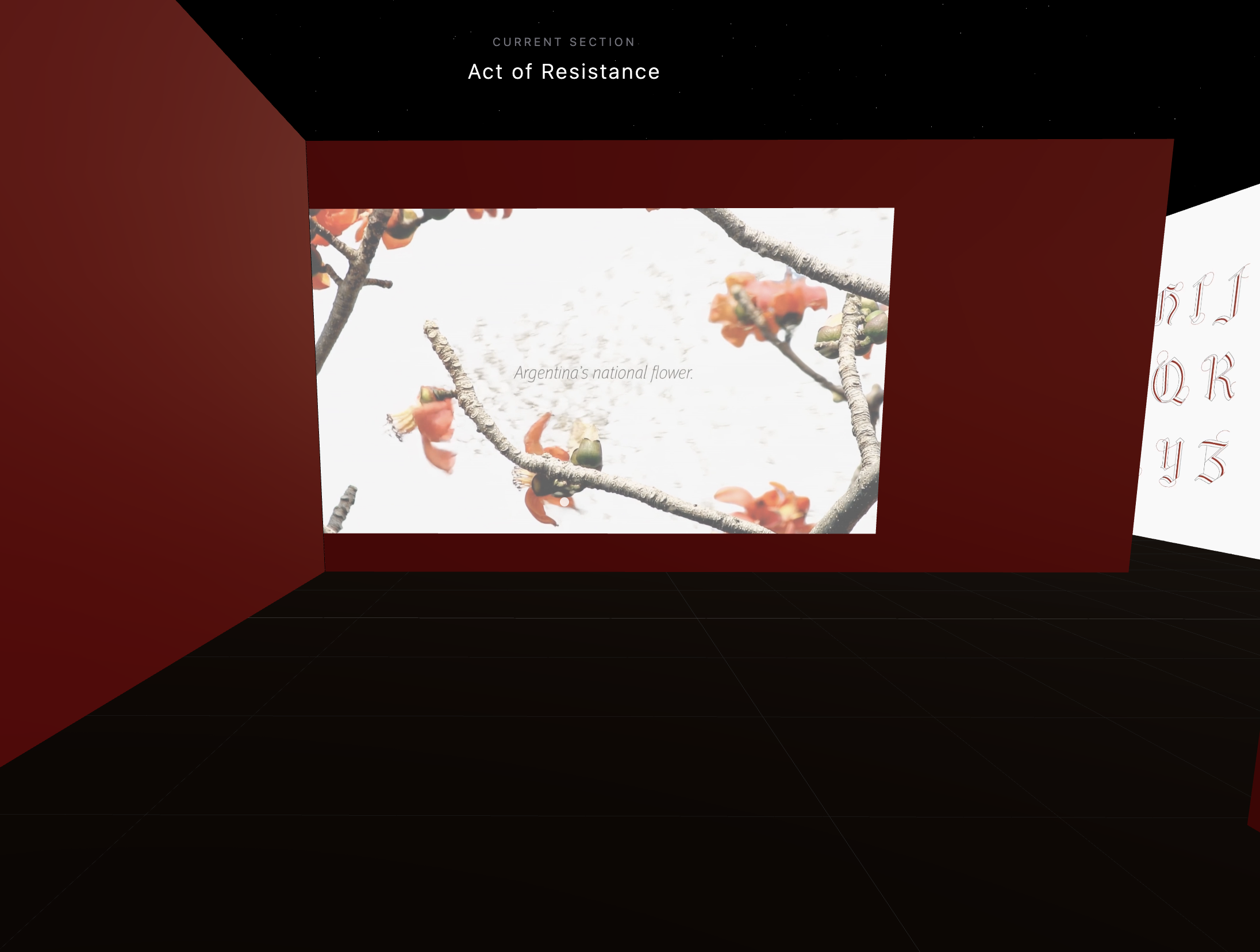
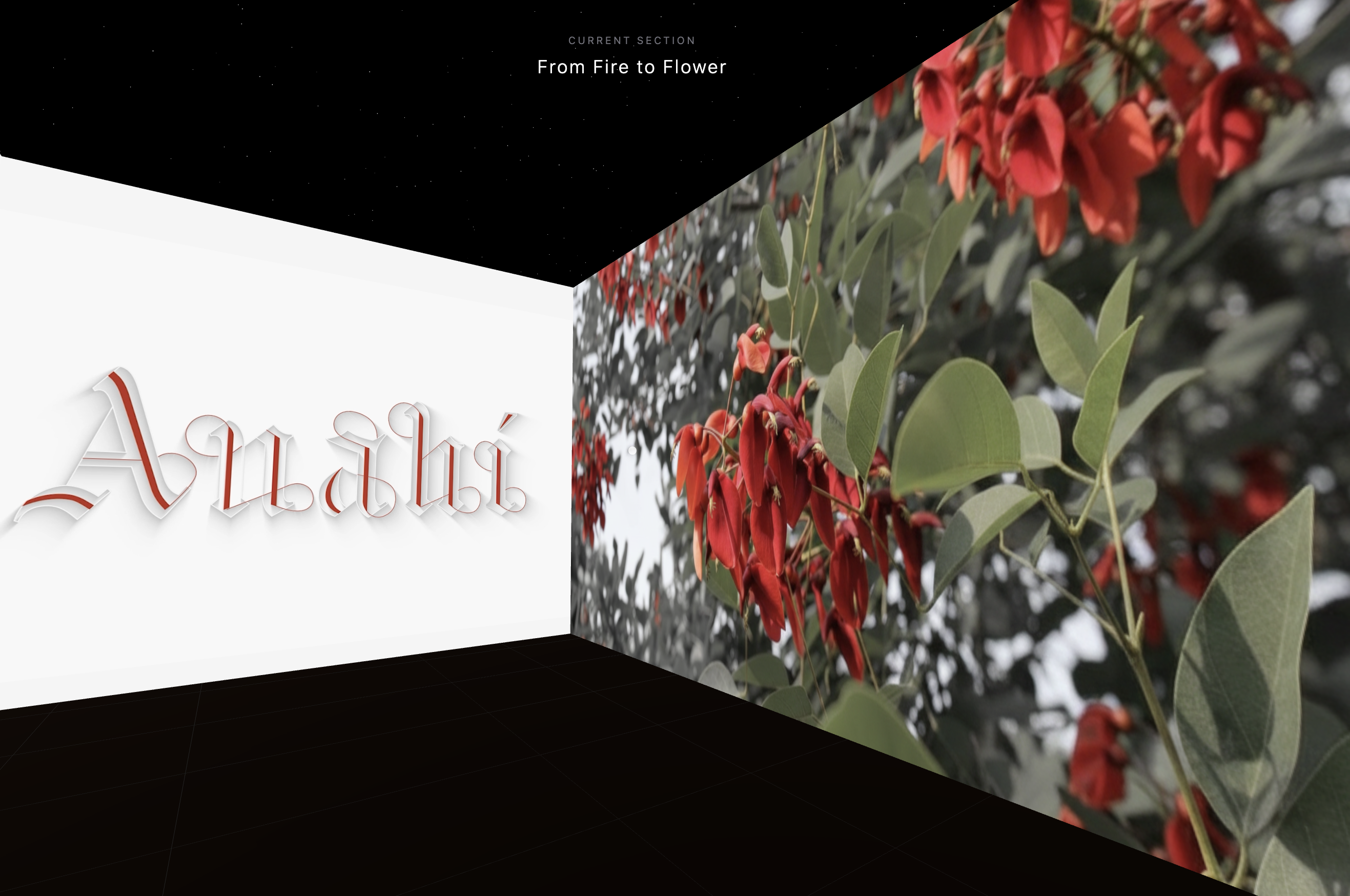
Anahi is a typeface inspired by the legend of a young Indigenous woman who resisted Spanish colonization. From the flames of her execution, legend says the ceibo tree grew—Argentina’s national flower.
02/LETTERFORMS
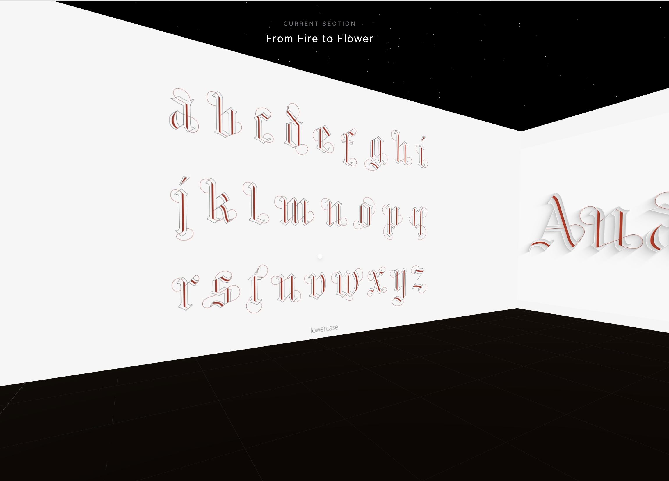
The typeface transforms this story into form: strong blackletter structures embraced by red lines that grow like fire and life.
Using a simplified blackletter base, red lines grow freely in unpredictable directions, creating a tension between structure and freedom.


03/DIGITAL EXHIBITION
A walk-through 3D digital exhibition designed to present the typeface and explain the concept behind it.
Process
AI tools were used to develop the digital exhibition focusing on creating an accessible and user-friendly experience.
Custom Tools
Much of the process involved asking AI to create the tools I needed to build and customize the exhibition. Examples include a tool to draw areas on the floor plan and assign each section a name, and a tool to change wall colors, allowing for a fully interactive and adaptable environment.
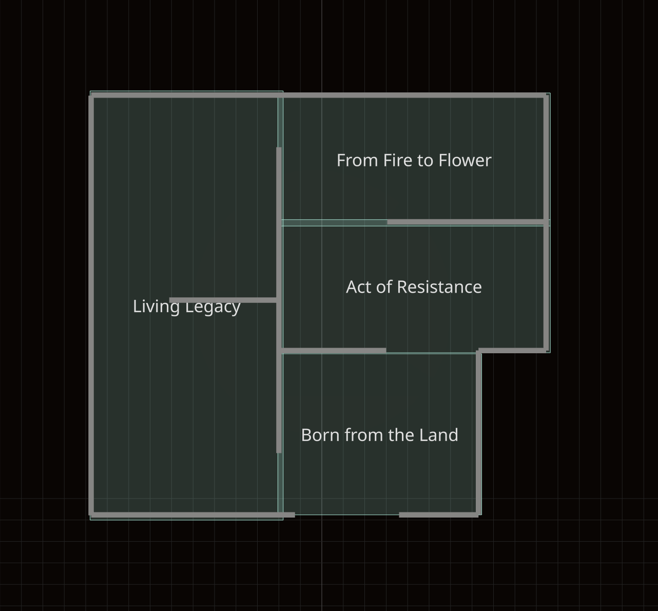
Section I
Born from the Land
This opening section introduces viewers to the typeface, presenting its concept and offering historical context.
Section II
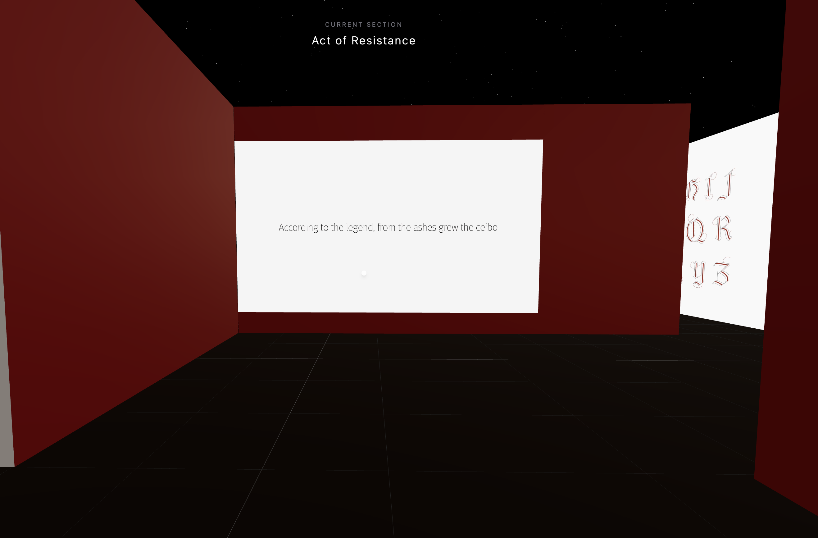
Section III
Section IV
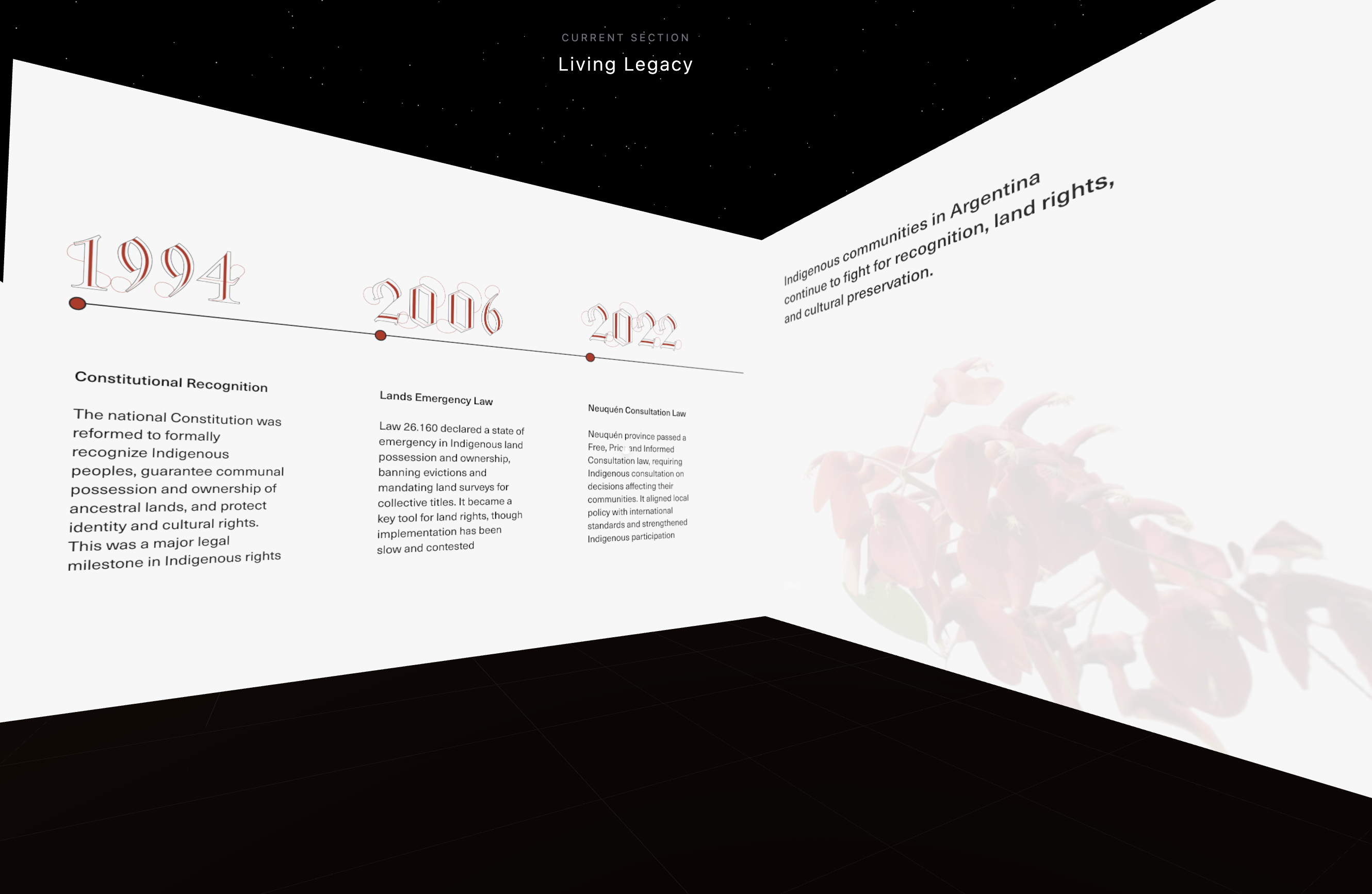
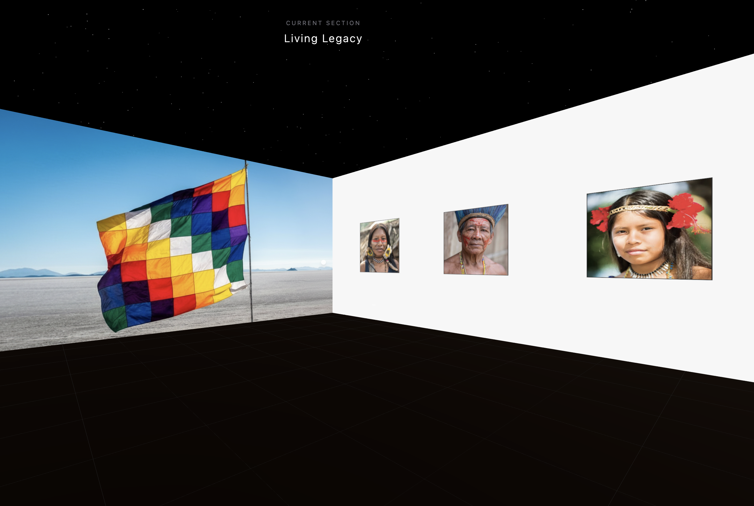
Living Legacy
Highlights the ongoing resilience and struggles of Indigenous communities in Argentina.
04/TAKEAWAYS
Balancing contrasting elements:
The story of Anahí has a clear arc, with a beginning and an end that feel very different from each other. The challenge was how to convey this contrast within a single typeface. The solution was to combine the rigid, sharp blackletter structure with organic, flowing red lines, creating a system that reflects both tension and growth.
Creating an experiential typeface:
To communicate Anahí’s layered story, I expanded the project into a 3D digital exhibition. Using AI tools and minimal coding, I built an immersive experience that lets viewers explore the narrative sequentially, connecting the historical and symbolic depth directly to the letterforms.